
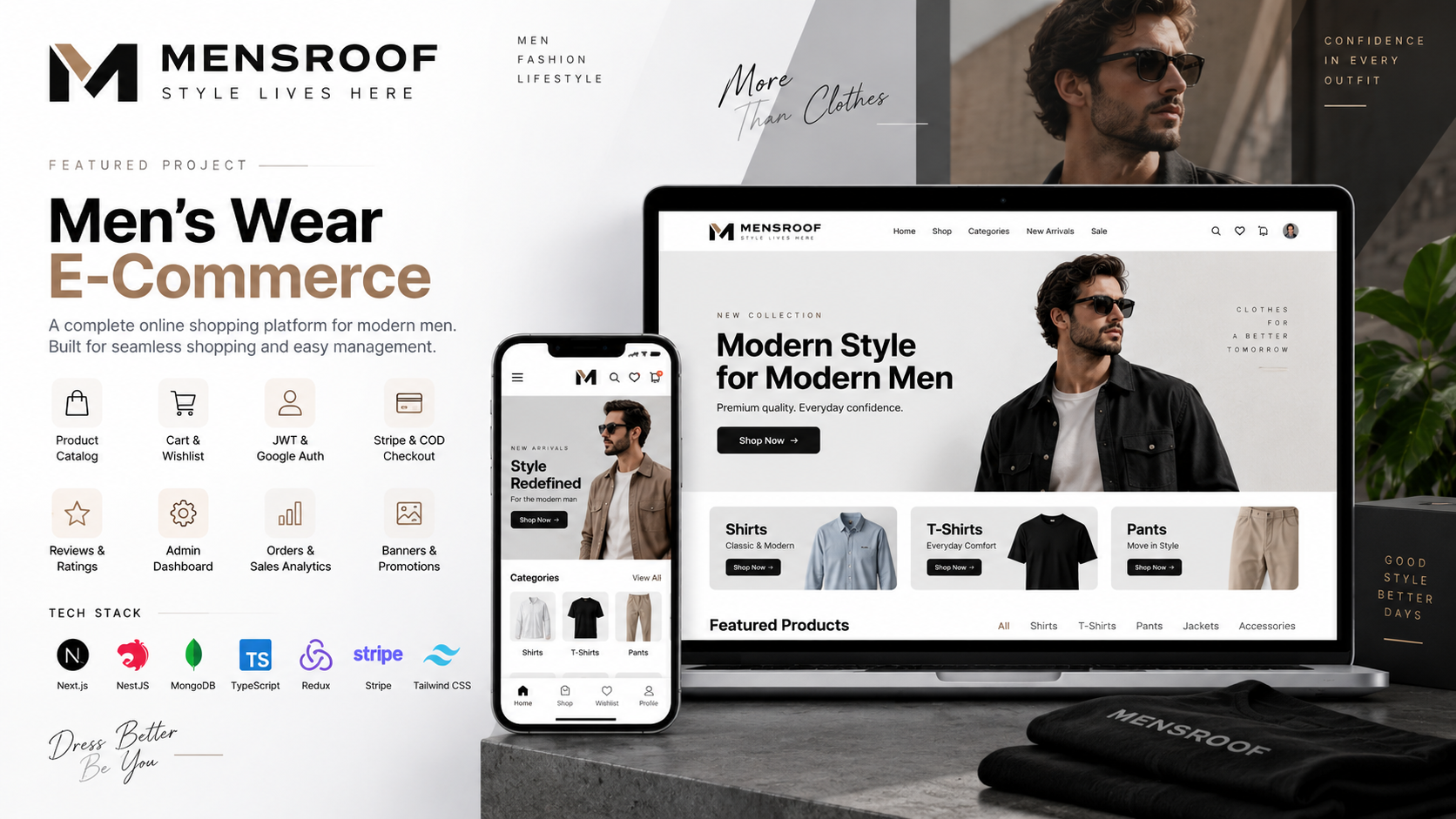
Ecommerce · 2026
A full menswear shop, from browse to paid
We designed and built Mensroof’s online shop and put it live — product pages, checkout, customer accounts, staff logins, and card payments in one store.
2–8 weeks
We find where people get stuck — late asks, vague buttons, forms that feel like work — then redesign those steps. You get talks with users or a review of the current product, journey maps, screens from wireframe to polish, and a short list of what to fix first.
Work
Examples where this service showed up in the work.
Ecommerce · 2026
We designed and built Mensroof’s online shop and put it live — product pages, checkout, customer accounts, staff logins, and card payments in one store.
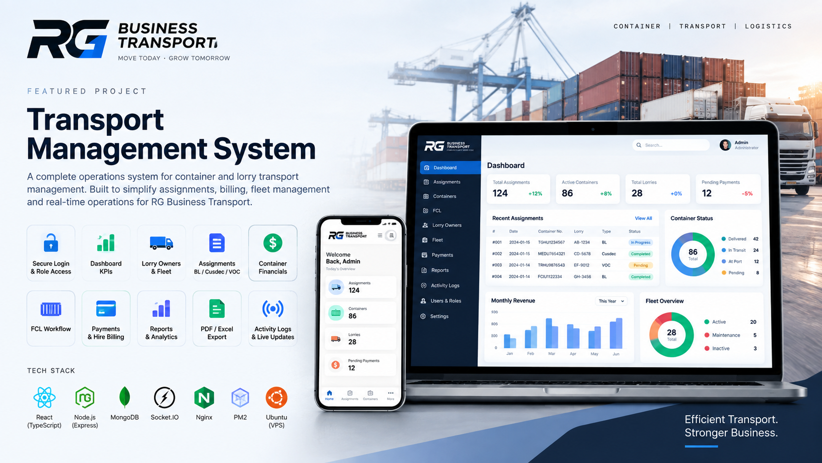
Transport · 2026
We designed, built, and launched a live operations system for RG Business Transport — fleet, assignments, billing, staff access, reports, and updates the whole team can share.
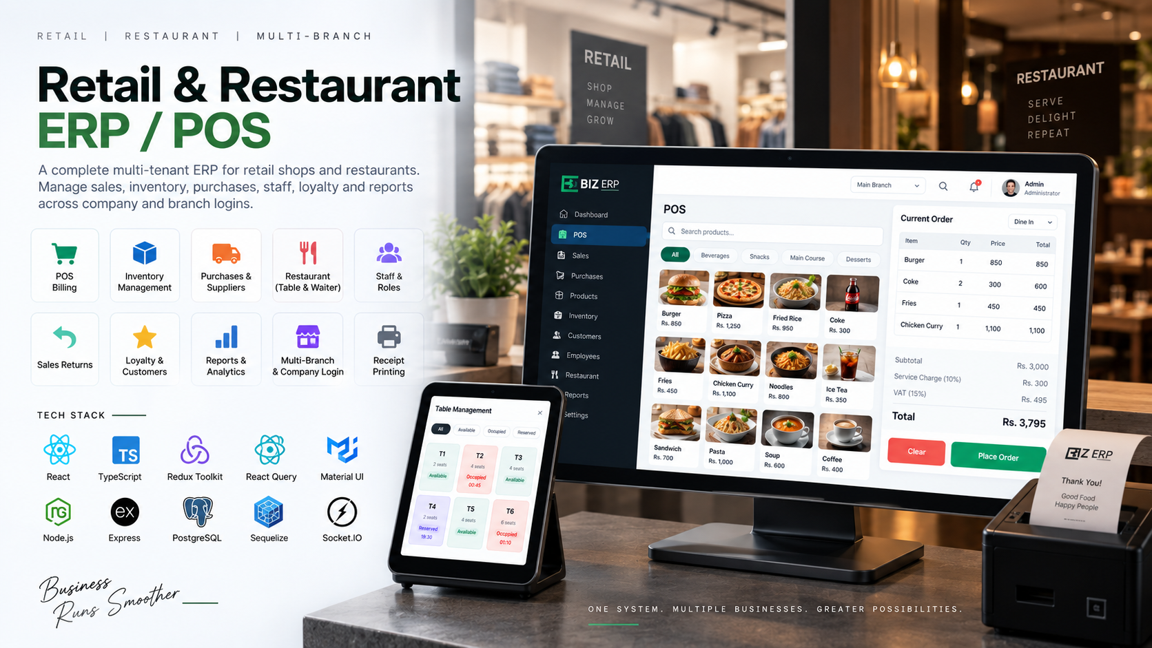
Retail · Restaurant · 2026
We built and improved a multi-branch ERP and POS for retail shops and restaurants — checkout, stock, purchases, staff, loyalty, and reports, with company and branch logins.
Questions
Short answers. If yours is missing, the contact form is still the fastest path.
Not sure this is the right service? Tell us what you are trying to do. We will suggest the smallest useful project.
Start a project